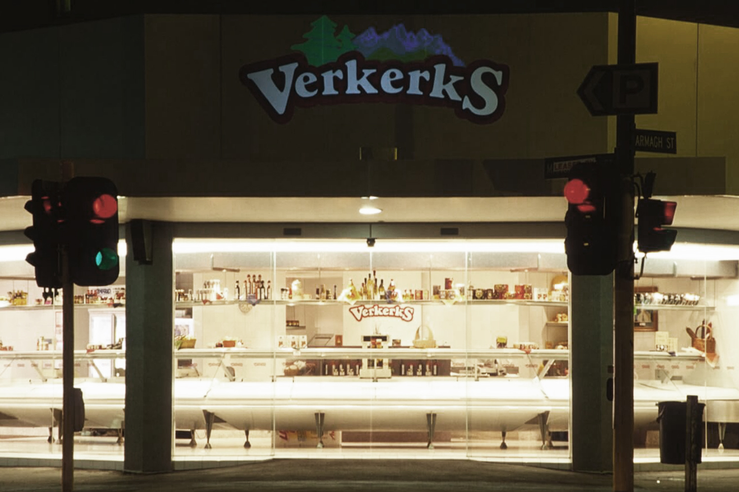
Verkerks
Christchurch Central, Christchurch
Butcheries have been trading in Christchurch on the corner of Armagh and Manchester Streets since the 1880s. Mr Aalt Verkerk took over an existing butcher shop on this site in 1957, then in 1969 commissioned a new shop to be built. This building served the family business well for over 20 years, but in recent years it became increasingly evident that a new shop was required.
The commission to design a new building on this site created a challenge; the premises had to accommodate a new shop including new refrigerated display counters, preparation areas, cooler and freezer rooms, offices, various mechanical services, resin floors, floor drains and grease traps, and the clients wanted to be trading again within eleven weeks.
The clients brief to us was straightforward; they wanted:
a) A shop environment that recognised their own Dutch European heritage but which sat comfortably within its Christchurch context.
b)Uncluttered and simple with no uncleanable surfaces. "The design has to look good and work even better" .
c)"No cost over runs and open on time".
The clients' brief has been achieved through careful spatial planning and design and the selection of well considered materials and finishes.
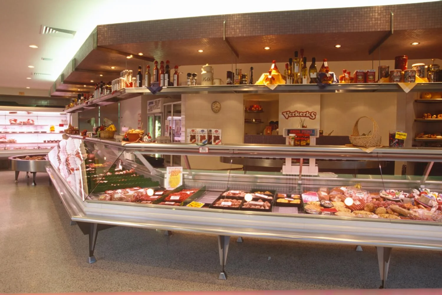
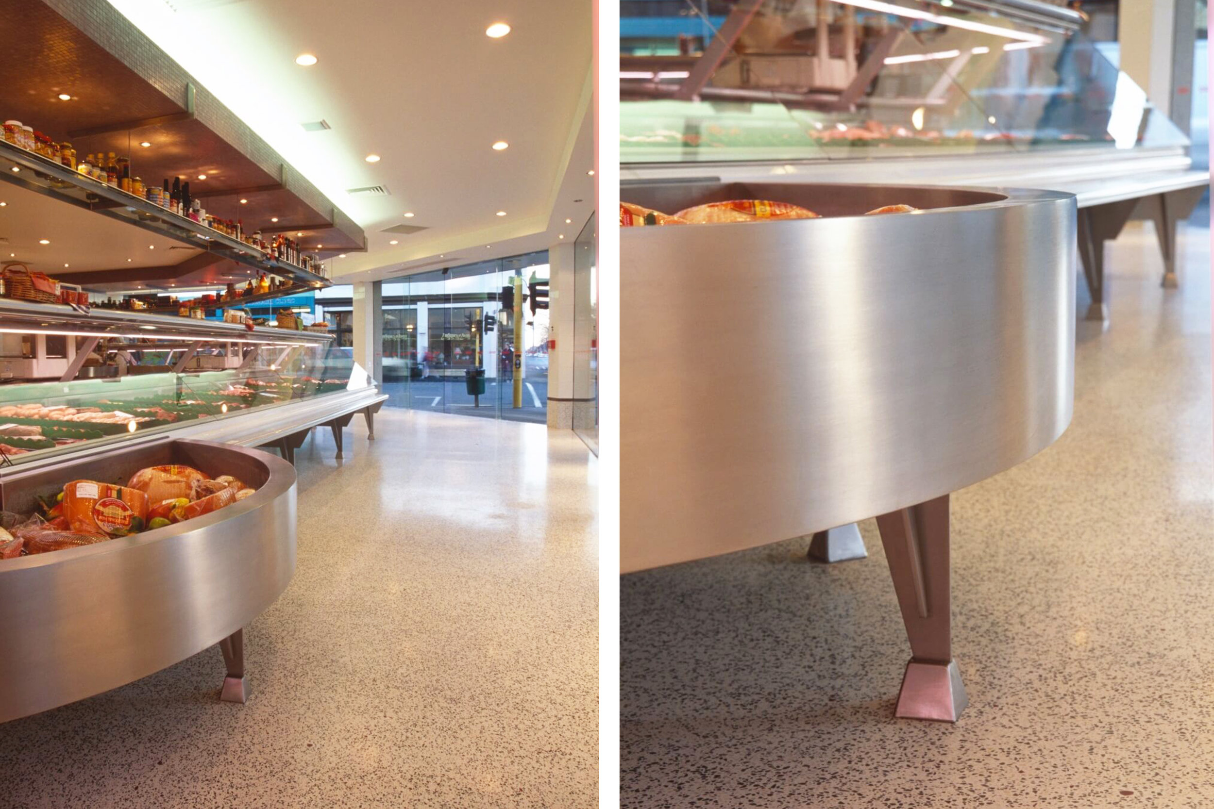
The client commissioned us to design new refrigerated display counters. One essential requirement was that the floor beneath the counter could be easily washed and that the design of the counter did not detract from their product. Display counters are a very important factor in a butcher shop; they sell the product. Clean thin legs create the illusion of a floating counter; a Terrazite floor throughout the shop creates a feeling of spaciousness and cleanliness. The circular chill-wells give the client the ability to display large amounts of wrapped bulk product in an orderly manner; this unique concept in the refrigerated display counter works exceptionally well, yet also registers as a major design feature.
Eleven weeks were allocated from the day the client moved out to the day they moved back in. The eleven weeks included the 28 days curing time require before the Terrazite and resin flooring could be applied over the new floor slabs. Tiles were quantified and ordered from Europe in advance and the fabrication of the custom designed refrigerated display counters began six months before demolition started. The programme was managed efficiently so that the shop could reopen on the agreed date.
The building was virtually demolished with only the outer boundary walls, half of the roof, a verandah and supporting columns remaining. All floors, internal walls, linings and services were removed. Retaining the structural skeleton meant that a great deal of time was saved by beginning the construction period with a more advanced building platform.
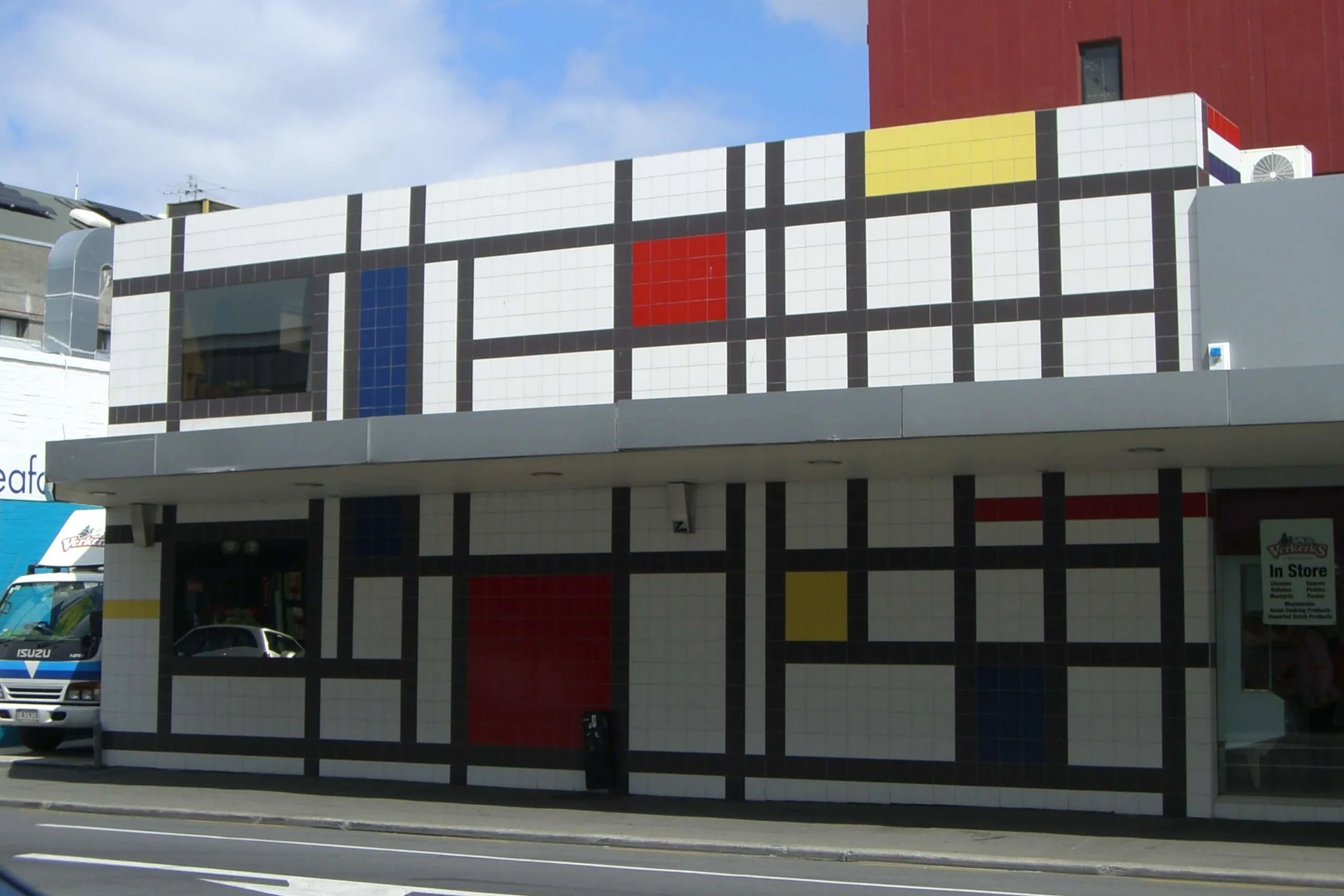
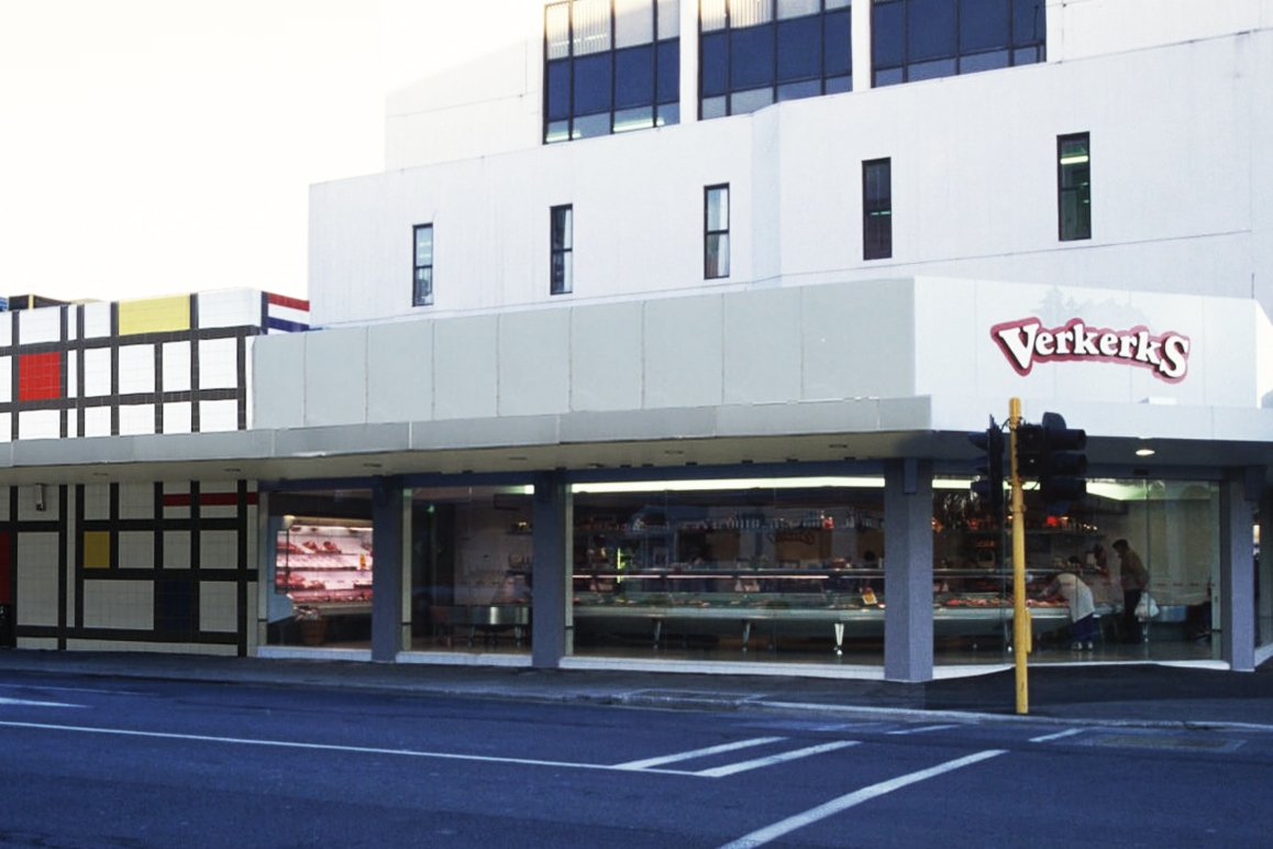
An additional floor was added to the south end of the building, thus freeing up more ground floor space for retail. The additional first floor area enabled the administration space to expand and created an open void over the Meat Preparation Area. The new first floor section of the building divides the building internally into the two sections; the Shop and the Preparation Area. The two types of activities carried out in these areas are opposing; one is an activity performed away from the public eye, the other is an activity carried out before the public eye. This division between the Shop and the Preparation Area is again expressed externally through the contrast of the primary coloured feature wall and the silver and glass shop frontage. The external division creates two building forms that are distinctly different, but together diminish what was a very low horizontal building.
The external tiled feature wall on Manchester Street draws on the work of Dutch modernists Mondriaan and Reitveld. This urban streetscape contributes to its immediate environment, from which people draw their own understanding. It can be perceived as part of the city grid or as a picture within an infinite picture. The design of the wall is universal in time and place.
The shop environment is light and spacious. Subtle flickers of purple sprinkled in the floor, a band of purple mosaic tiles on the walls and lighter shades of purple mosaics on the bulk head and part-height wall complement the colour of the meat product on display. Strategic lighting, coffered ceilings and bulkheads articulate areas within the shop, while integrating the display counters, shelving displays and ceiling. The colour complements the colour of fresh meat and small goods without being an over dominant fashion statement.

